TELYXAR
TELYXAR is an emergency backpack system: 21 modules and 4 add-ons that let a person live autonomously for seven days through a flood, an earthquake, a fire, radiation, a blackout or severe cold. The goal wasn't to sell a backpack off the shelf but to present the product to investors and partners so they'd want to back it. We built a presentation-style website that changes as you scroll and generated every visual with AI — from disaster footage to shots of each module, without a single photo shoot.
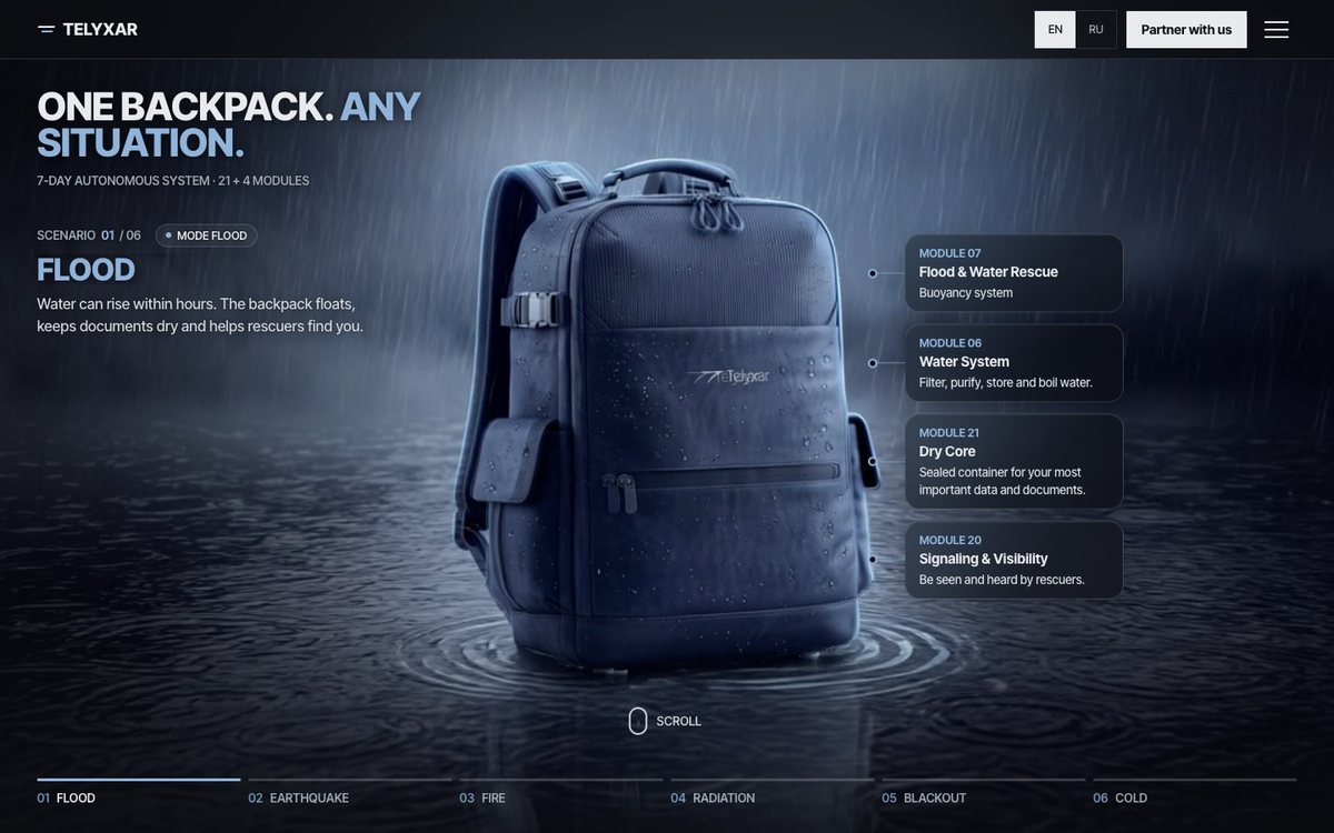
Not a landing page — an investor presentation
A typical landing page pushes the “Buy” button. An investor needs something else: to understand the whole product — what's inside, how it works in each situation and why it's a system rather than a set of items. So the TELYXAR website is built like a strong pitch: scenarios and emotion first, then the problem and the solution, then the whole system module by module, the specifications and answers to the key questions.
The tone is set by the loading screen: a “System check” runs through water, power, comms, medical and shelter one by one, and only then opens the site. From the first second it's clear this isn't a hiking backpack but a survival system.
Six disasters on the first screen
The first screen switches between six scenarios: flood, earthquake, fire, radiation, blackout and cold. Each has its own video, its own backpack mode and its own modules that save the day: buoyancy and the sealed Dry Core for documents in a flood, a gas mask and a thermal blanket in a fire.
We generated all six videos in Higgsfield. The same backpack in six different worlds — no film crew, no sets, no location trips.
A product that has never been photographed
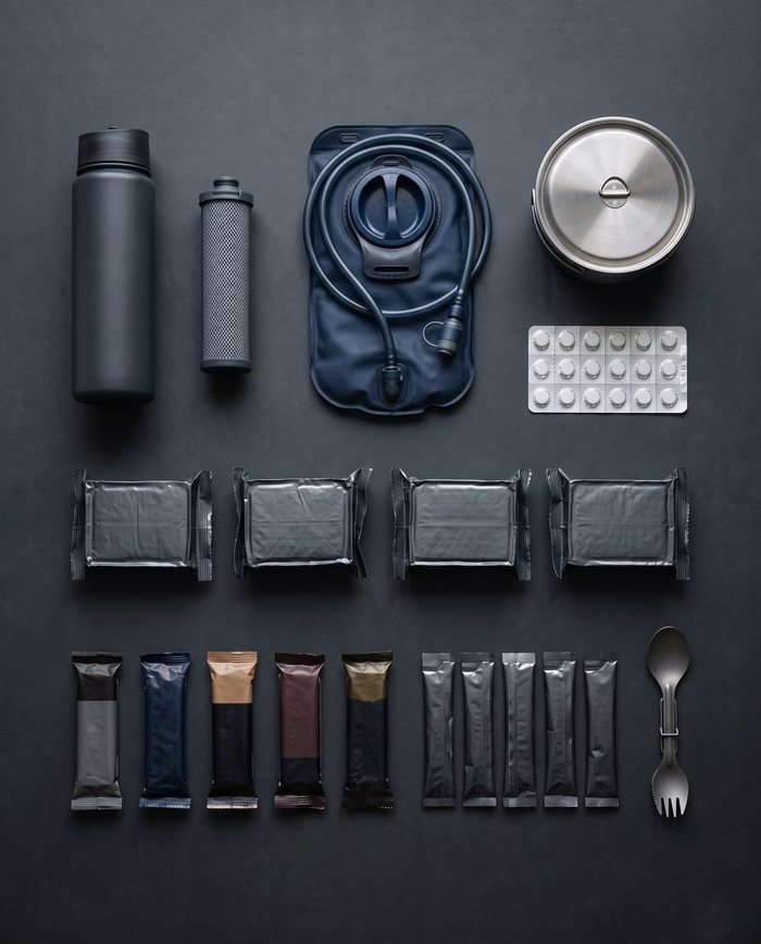
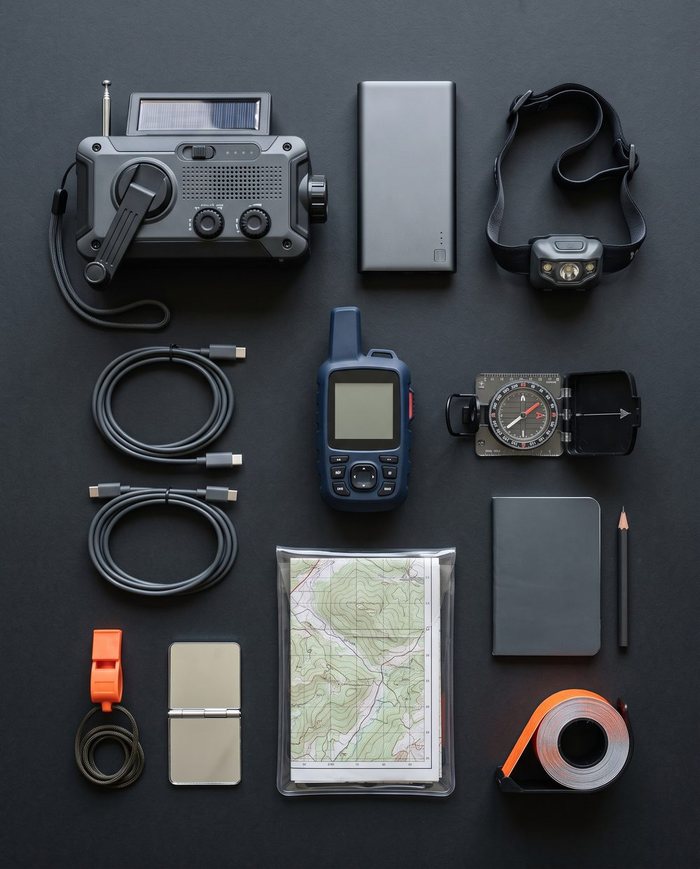
To show a product to investors you usually need a prototype, a photo studio and a location shoot. We did without them: every visual of the product — the backpack itself, its modules and flat lays, the scenes by the door, in the forest and in the pouring rain — was generated with AI. Not a single photo shoot.
All the visuals share one style — dark tones, cold light, rain, close-up details. That's why the site looks like an expensive ad campaign rather than a collection of images from different sources.



A website that changes as you scroll
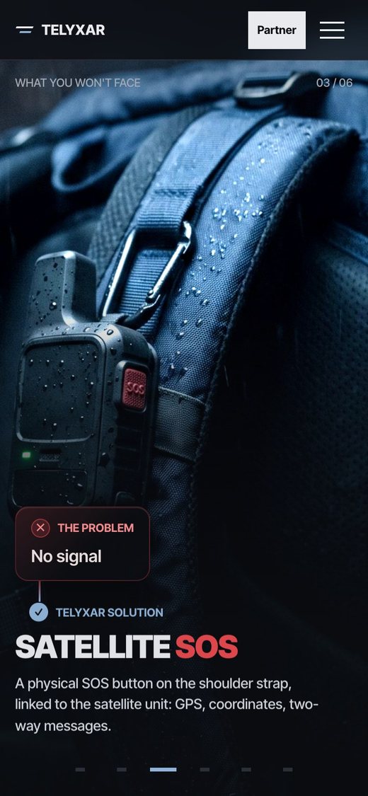
The key feature is sections that come alive as you scroll. In “What you won't face” the screen doesn't slide away — it changes scenes: “30 minutes of panic packing” turns into “30 seconds to the door”, “Dead phone” into “Three ways to charge”, “No signal” into “Satellite SOS”.
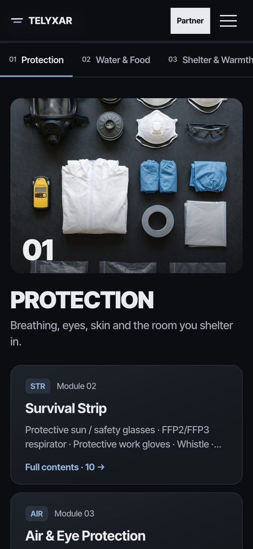
Next comes “Inside the system”: six module groups replace one another on a single screen — the flat lay, the module cards, the “Group 01 / 06” counter. Visitors move through the site like a pitch at an investor meeting, only at their own pace.
21 modules, each in its own place
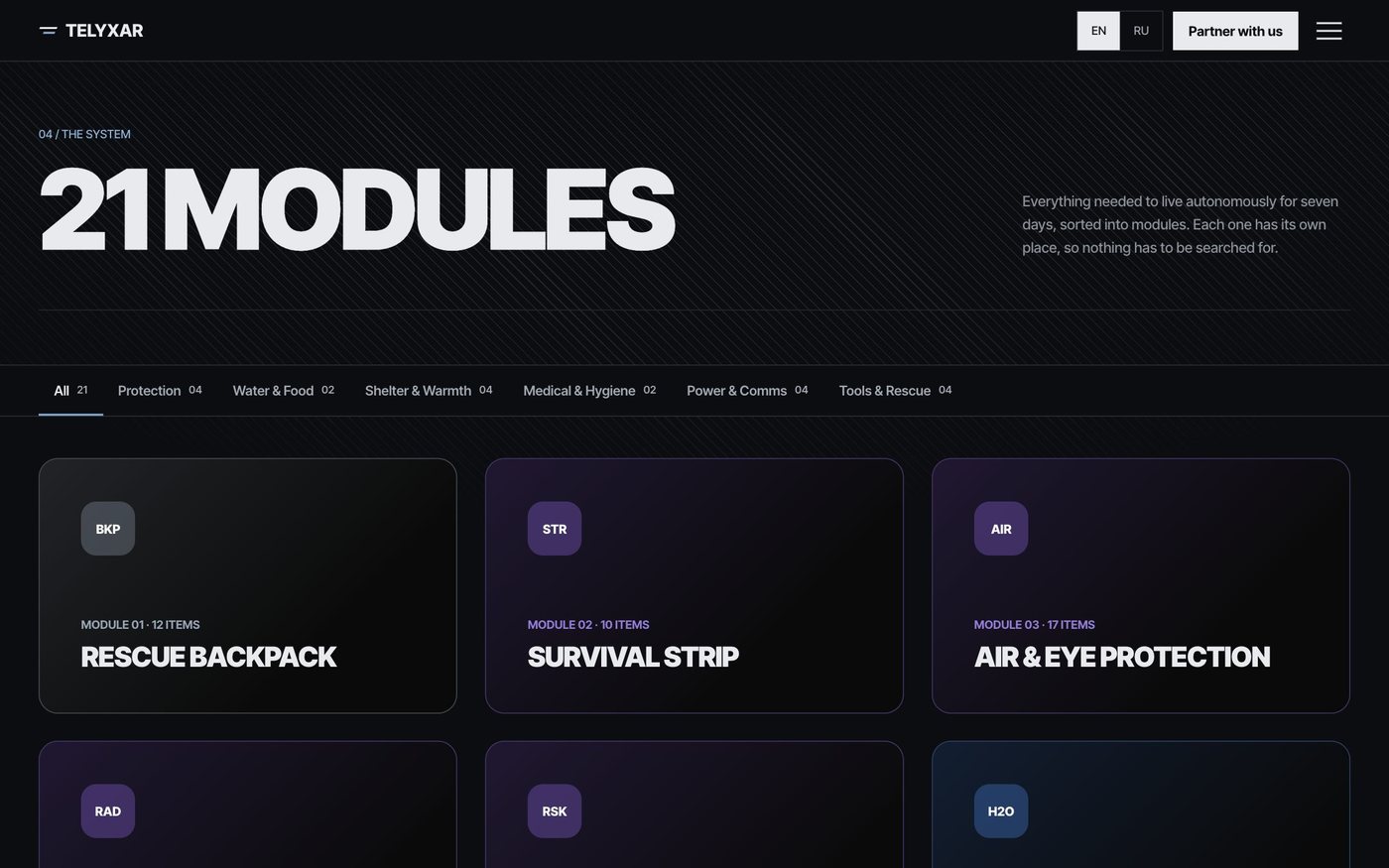
The whole system is laid out as a catalogue: 21 modules with a filter by group — protection, water and food, shelter and warmth, medical, power and comms, tools. Every module shows its item count and full contents.
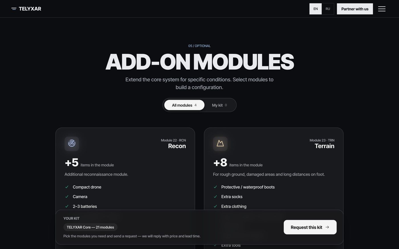
On top of that there's an add-on builder: Recon with a compact drone, Terrain for rough ground, Family for the whole family and Extreme for especially harsh conditions. A partner puts together their own configuration with the “Add to my kit” button and sends a request straight away.

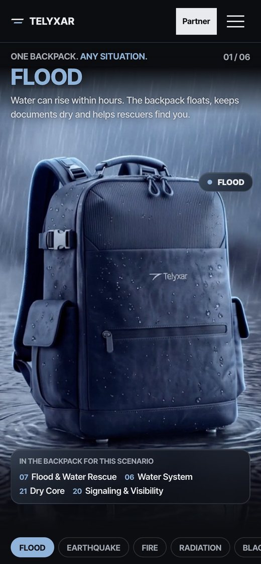
Just as striking on a phone
Investors often open a link on their phone, so we built the mobile version separately rather than just shrinking the desktop. Scenarios switch with tabs, the problem–solution scenes stay full-screen and the module catalogue scrolls with a swipe.
A short path to a deal
The “Partner with us” button is visible on every screen. The form sorts requests by type right away: kit order, distribution, retail, government and NGOs, press. Next to it are answers to common questions about the kit, the technology and maintenance, plus a short spec sheet: 35–40 litres, 21 + 4 modules, 7 days of autonomy.
Tell us about your business and we will show you what could be built for your needs.
Discuss a projectWe do not build “one more website”. We put AI into how a business runs: leads stop getting lost, routine goes to automation, the numbers grow.